Apple just dropped something that’s got iPhone users buzzing – and honestly, it’s pretty spectacular. The new Liquid Glass icons in iOS 26 are probably the most dramatic visual change we’ve seen since iOS 7 back in 2013. These aren’t just your regular app icons with a fresh coat of paint; they’re completely see-through, letting your wallpaper shine through in ways that feel almost magical.
Think of it like having actual glass panels on your phone screen. Your favorite apps become translucent windows that reflect and refract light, creating this layered effect that adapts to whatever background you’ve chosen. It’s minimalist, it’s modern, and it’s definitely going to divide people into “love it” or “hate it” camps.
What Makes Liquid Glass Icons Special?
These new icons aren’t just about looks – though they certainly deliver in that department. Apple has designed them to be part of a unified visual language that spans across all their devices. Whether you’re using your iPhone, iPad, Mac, or Apple Watch, you’ll see similar translucent elements that tie everything together.
The technology behind Liquid Glass creates what Apple calls “specular highlights” – basically, the icons catch and reflect light in realistic ways. They also automatically adjust between light and dark environments, so they look great whether you’re using your phone in bright sunlight or in bed with the lights off.
What’s really clever is how these icons interact with your wallpaper. Instead of sitting on top like traditional icons, they seem to blend with whatever image you’ve chosen as your background. If you’ve got a colorful sunset photo, those warm tones will subtly show through your app icons. Got a cool blue ocean scene? Your icons will pick up those cooler hues.
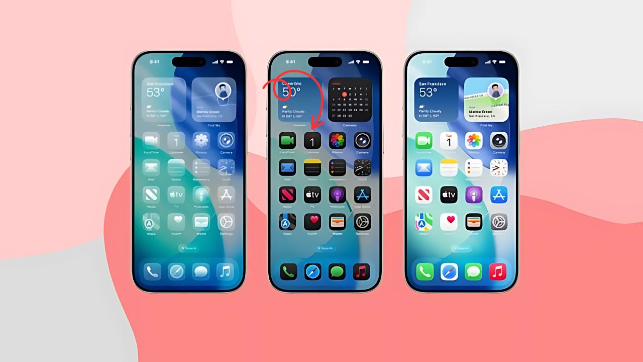
Step-by-Step: Getting Liquid Glass Icons on Your iPhone
First Things First: Install iOS 26 Beta
Right now, Liquid Glass icons are only available in the iOS 26 public beta. The full version won’t hit everyone’s phones until September 2025, but if you’re eager to try it out, you can download the beta version now.
Before you jump in, make sure your iPhone is compatible with iOS 26. Most newer iPhones support it, but it’s worth checking Apple’s compatibility list first. Also, remember that beta software can be buggy, so maybe don’t install it on your main phone if you rely on it for work.
Enabling the Liquid Glass Look
Once you’ve got iOS 26 beta running, getting those transparent icons is surprisingly simple:
- Long-press anywhere on your home screen – this puts your phone into the familiar “jiggle mode” where you can move apps around
- Tap the “Edit” button that appears in the top-left corner
- Select “Customize” from the popup menu
- Choose “Clear” from the options at the bottom of your screen
That’s it! Your icons will immediately transform into their glass versions. You’ll notice they lose most of their color and become see-through, letting your wallpaper show through.
Fine-Tuning Your Glass Effect
Apple gives you three different Clear options to choose from:
- Clear Light: Makes icons completely transparent with a light, airy feel
- Clear Dark: Keeps some of the original colors but adds the glass effect
- Clear Auto: Automatically switches between light and dark modes based on the time of day
You can experiment with all three to see which one works best with your wallpaper and personal style.
The Good, The Bad, and The Glassy
Why People Love Liquid Glass Icons
The minimalist aesthetic is undeniably sleek. If you’re someone who loves clean, modern design, these icons deliver that in spades. They make your wallpaper the star of the show while still keeping your apps easily accessible.
There’s also something oddly satisfying about the way they interact with light and movement. Tilt your phone slightly, and you’ll notice subtle shifts in how the icons reflect your surroundings. It’s a small detail, but it makes the whole interface feel more alive and responsive.
For people who like to frequently change their wallpapers, Liquid Glass icons are fantastic because they adapt to whatever background you choose. You don’t have to worry about whether your icons clash with your new wallpaper – they’ll blend seamlessly with whatever you pick.
The Challenges Some Users Face
Not everyone’s jumping on the Liquid Glass bandwagon, and for good reason. The most common complaint is that the icons can be harder to distinguish at a glance. When everything’s transparent and colorless, finding specific apps becomes more challenging, especially if you have a busy wallpaper.
Readability can also be an issue. App names might get lost against busy backgrounds, and some users find the constant transparency distracting rather than elegant. If you use your phone heavily throughout the day, this visual confusion can actually slow you down.
Customizing Your Experience
Making Icons More Visible
If you love the Liquid Glass look but struggle with visibility, iOS 26 includes several accessibility options that can help:
Reduce Transparency: Go to Settings > Accessibility > Display & Text Size and toggle on “Reduce Transparency.” This adds darker backgrounds to translucent areas, improving contrast without completely losing the glass effect.
Increase Contrast: This setting, found in the same menu, can make text and icons stand out more against your wallpaper.
Wallpaper Dimming: If your icons are getting lost against a bright wallpaper, you can dim your background by tapping the sun icon in the customization panel.
Mixing and Matching Styles
You don’t have to go all-in on Liquid Glass. iOS 26 still supports the traditional colored icons and the tinted versions introduced in iOS 18. You can even mix different styles if you want some apps to stand out more than others.
Liquid Glass Across Apple’s Ecosystem
| Device | Liquid Glass Features | Key Benefits |
|---|---|---|
| iPhone | Home screen icons, Control Center, app interfaces | Unified look, wallpaper integration |
| iPad | App icons, dock, sidebar elements | Better multitasking visual hierarchy |
| Mac | Menu bar, dock, window controls | Seamless desktop integration |
| Apple Watch | Watch faces, app icons, complications | Improved readability on small screen |
| Apple TV | Interface elements, app tiles | Modern living room aesthetic |
One of the coolest aspects of Liquid Glass is how it creates consistency across all your Apple devices. Switch from your iPhone to your Mac, and you’ll see similar translucent elements that make the transition feel seamless. It’s like Apple has created a visual language that speaks the same way regardless of which device you’re using.
Tips for Getting the Most Out of Liquid Glass
Choosing the Right Wallpaper
Your wallpaper choice becomes much more important with Liquid Glass icons. Simple, low-contrast backgrounds work best because they won’t compete with your app icons for attention. Think solid colors, gentle gradients, or photos with lots of negative space.
Busy wallpapers with lots of detail can make it nearly impossible to see your apps clearly. If you have a favorite photo that’s quite busy, consider using a blurred or darkened version as your wallpaper.
Organizing for Clarity
With less visual distinction between apps, organization becomes crucial. Consider grouping similar apps together in folders, or arrange them by frequency of use rather than category. You might find that muscle memory becomes more important than visual recognition.
Accessibility Considerations
If you have vision difficulties or simply prefer higher contrast interfaces, don’t feel pressured to use Liquid Glass just because it’s new. Apple has kept all the traditional icon styles available, and you can always switch back to colored icons if the transparent versions don’t work for you.
Looking Ahead: The Future of iPhone Design
Liquid Glass represents more than just a visual refresh – it’s Apple’s bet on the future of interface design. As we move toward more AR and mixed reality experiences, having interface elements that can blend with real-world environments becomes increasingly important.
This design language will likely evolve over the coming years, and we’ll probably see it become more sophisticated as Apple refines the technology. The company has stated that Liquid Glass will be the foundation for the next decade of software design, so we’re just seeing the beginning.
Should You Make the Switch?
Whether Liquid Glass icons are right for you depends on your priorities. If you value cutting-edge design and don’t mind a learning curve, they’re definitely worth trying. The aesthetic is undeniably modern, and once you adjust to the new visual language, it can feel refreshing after years of the same icon style.
However, if you prioritize functionality over form, or if you use your phone in situations where quick app recognition is crucial, you might prefer to stick with traditional colored icons. The good news is that Apple has made it easy to switch between styles, so you can experiment without commitment.
The Liquid Glass era is here, and it’s bringing some of the most significant visual changes we’ve seen in iOS in over a decade. Whether you embrace the transparency or stick with the familiar, one thing’s clear: Apple isn’t afraid to push the boundaries of what an iPhone interface can look like.